tag in HTML.
In the example below, three paragraphs are defined under one
. The section has a property value of Red, therefore the background color of the paragraphs is also red.
[!code-xaml[FlowOvwSnippets_snip#SectionExampleWholePage](~/samples/snippets/csharp/VS_Snippets_Wpf/FlowOvwSnippets_snip/CS/SectionExample.xaml#sectionexamplewholepage)]
[!code-csharp[FlowOvwSnippets_procedural_snip#SectionCodeOnlyExampleWholePage](~/samples/snippets/csharp/VS_Snippets_Wpf/FlowOvwSnippets_procedural_snip/CSharp/SectionExample.cs#sectioncodeonlyexamplewholepage)]
[!code-vb[FlowOvwSnippets_procedural_snip#SectionCodeOnlyExampleWholePage](~/samples/snippets/visualbasic/VS_Snippets_Wpf/FlowOvwSnippets_procedural_snip/VisualBasic/SectionExample.vb#sectioncodeonlyexamplewholepage)]
**BlockUIContainer**
enables elements (i.e. a ) to be embedded in block-derived flow content. (see below) is used to embed elements in inline-derived flow content. and are important because there is no other way to use a in flow content unless it is contained within one of these two elements.
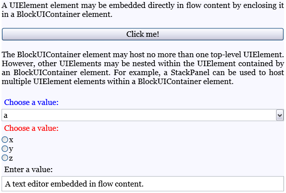
The following example shows how to use the element to host objects within flow content.
[!code-xaml[SpanSnippets#_BlockUIXAML](~/samples/snippets/csharp/VS_Snippets_Wpf/SpanSnippets/CSharp/Window1.xaml#_blockuixaml)]
The following figure shows how this example renders:
**List**
is used to create a bulleted or numeric list. Set the property to a enumeration value to determine the style of the list. The example below shows how to create a simple list.
[!code-xaml[FlowOvwSnippets_snip#ListExampleWholePage](~/samples/snippets/csharp/VS_Snippets_Wpf/FlowOvwSnippets_snip/CS/ListExample.xaml#listexamplewholepage)]
[!code-csharp[FlowOvwSnippets_procedural_snip#ListCodeOnlyExampleWholePage](~/samples/snippets/csharp/VS_Snippets_Wpf/FlowOvwSnippets_procedural_snip/CSharp/ListExample.cs#listcodeonlyexamplewholepage)]
[!code-vb[FlowOvwSnippets_procedural_snip#ListCodeOnlyExampleWholePage](~/samples/snippets/visualbasic/VS_Snippets_Wpf/FlowOvwSnippets_procedural_snip/VisualBasic/ListExample.vb#listcodeonlyexamplewholepage)]
> [!NOTE]
> is the only flow element that uses the to manage child elements.
**Table**
is used to create a table. is similar to the element but it has more capabilities and, therefore, requires greater resource overhead. Because is a , it cannot be used in flow content unless it is contained in a or . For more information on , see [Table Overview](table-overview.md).
### Inline-derived Classes
**Run**
is used to contain unformatted text. You might expect objects to be used extensively in flow content. However, in markup, elements are not required to be used explicitly. is required to be used when creating or manipulating flow documents by using code. For example, in the markup below, the first specifies the element explicitly while the second does not. Both paragraphs generate identical output.
[!code-xaml[FlowOvwSnippets_snip#RunExample1](~/samples/snippets/csharp/VS_Snippets_Wpf/FlowOvwSnippets_snip/CS/RunSnippetsExample.xaml#runexample1)]
> [!NOTE]
> Starting in the .NET Framework 4, the property of the object is a dependency property. You can bind the property to a data source, such as a . The property fully supports one-way binding. The property also supports two-way binding, except for . For an example, see .
**Span**
groups other inline content elements together. No inherent rendering is applied to content within a element. However, elements that inherit from including , , and do apply formatting to text.
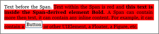
Below is an example of a being used to contain inline content including text, a element, and a .
[!code-xaml[FlowOvwSnippets_snip#SpanExampleWholePage](~/samples/snippets/csharp/VS_Snippets_Wpf/FlowOvwSnippets_snip/CS/SpanExample.xaml#spanexamplewholepage)]
The following screenshot shows how this example renders.
**InlineUIContainer**
enables elements (i.e. a control like ) to be embedded in an content element. This element is the inline equivalent to described above. Below is an example that uses to insert a inline in a .
[!code-xaml[FlowOvwSnippets_snip#InlineUIContainerExampleWholePage](~/samples/snippets/csharp/VS_Snippets_Wpf/FlowOvwSnippets_snip/CS/InlineUIContainerExample.xaml#inlineuicontainerexamplewholepage)]
[!code-csharp[FlowOvwSnippets_procedural_snip#InlineUIContainerCodeOnlyExampleWholePage](~/samples/snippets/csharp/VS_Snippets_Wpf/FlowOvwSnippets_procedural_snip/CSharp/InlineUIContainerExample.cs#inlineuicontainercodeonlyexamplewholepage)]
[!code-vb[FlowOvwSnippets_procedural_snip#InlineUIContainerCodeOnlyExampleWholePage](~/samples/snippets/visualbasic/VS_Snippets_Wpf/FlowOvwSnippets_procedural_snip/VisualBasic/InlineUIContainerExample.vb#inlineuicontainercodeonlyexamplewholepage)]
> [!NOTE]
> does not need to be used explicitly in markup. If you omit it, an will be created anyway when the code is compiled.
**Figure and Floater**
and are used to embed content in Flow Documents with placement properties that can be customized independent of the primary content flow. or elements are often used to highlight or accentuate portions of content, to host supporting images or other content within the main content flow, or to inject loosely related content such as advertisements.
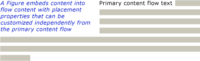
The following example shows how to embed a into a paragraph of text.
[!code-xaml[FlowOvwSnippets_snip#FigureExampleWholePage](~/samples/snippets/csharp/VS_Snippets_Wpf/FlowOvwSnippets_snip/CS/FigureExample.xaml#figureexamplewholepage)]
[!code-csharp[FlowOvwSnippets_procedural_snip#FigureCodeOnlyExampleWholePage](~/samples/snippets/csharp/VS_Snippets_Wpf/FlowOvwSnippets_procedural_snip/CSharp/FigureExample.cs#figurecodeonlyexamplewholepage)]
[!code-vb[FlowOvwSnippets_procedural_snip#FigureCodeOnlyExampleWholePage](~/samples/snippets/visualbasic/VS_Snippets_Wpf/FlowOvwSnippets_procedural_snip/VisualBasic/FigureExample.vb#figurecodeonlyexamplewholepage)]
The following illustration shows how this example renders.
and differ in several ways and are used for different scenarios.
**Figure:**
- Can be positioned: You can set its horizontal and vertical anchors to dock it relative to the page, content, column or paragraph. You can also use its and properties to specify arbitrary offsets.
- Is sizable to more than one column: You can set height and width to multiples of page, content or column height or width. Note that in the case of page and content, multiples greater than 1 are not allowed. For example, you can set the width of a to be "0.5 page" or "0.25 content" or "2 Column". You can also set height and width to absolute pixel values.
- Does not paginate: If the content inside a does not fit inside the , it will render whatever content does fit and the remaining content is lost
**Floater:**
- Cannot be positioned and will render wherever space can be made available for it. You cannot set the offset or anchor a .
- Cannot be sized to more than one column: By default, sizes at one column. It has a property that can be set to an absolute pixel value, but if this value is greater than one column width it is ignored and the floater is sized at one column. You can size it to less than one column by setting the correct pixel width, but sizing is not column-relative, so "0.5Column" is not a valid expression for width. has no height property and it's height cannot be set, it’s height depends on the content
- paginates: If its content at its specified width extends to more than 1 column height, floater breaks and paginates to the next column, the next page, etc.
is a good place to put standalone content where you want to control the size and positioning, and are confident that the content will fit in the specified size. is a good place to put more free-flowing content that flows similar to the main page content, but is separated from it.
**LineBreak**
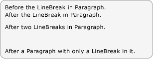
causes a line break to occur in flow content. The following example demonstrates the use of .
[!code-xaml[FlowOvwSnippets_snip#LineBreakExampleWholePage](~/samples/snippets/csharp/VS_Snippets_Wpf/FlowOvwSnippets_snip/CS/LineBreakExample.xaml#linebreakexamplewholepage)]
The following screenshot shows how this example renders.
### Flow Collection Elements
In many of the examples above, the and are used to construct flow content programmatically. For example, to add elements to a , you can use the syntax:
```csharp
myParagraph.Inlines.Add(new Run("Some text"));
```
This adds a to the of the . This is the same as the implicit found inside a in markup:
```xml
Some Text
```
As an example of using the , the following example creates a new and then uses the **Add** method to add a new to the contents.
[!code-csharp[FlowDocumentSnippets#_SectionBlocksAdd](~/samples/snippets/csharp/VS_Snippets_Wpf/FlowDocumentSnippets/CSharp/Window1.xaml.cs#_sectionblocksadd)]
[!code-vb[FlowDocumentSnippets#_SectionBlocksAdd](~/samples/snippets/visualbasic/VS_Snippets_Wpf/FlowDocumentSnippets/visualbasic/window1.xaml.vb#_sectionblocksadd)]
In addition to adding items to a flow collection, you can remove items as well. The following example deletes the last element in the .
[!code-csharp[SpanSnippets#_SpanInlinesRemoveLast](~/samples/snippets/csharp/VS_Snippets_Wpf/SpanSnippets/CSharp/Window1.xaml.cs#_spaninlinesremovelast)]
[!code-vb[SpanSnippets#_SpanInlinesRemoveLast](~/samples/snippets/visualbasic/VS_Snippets_Wpf/SpanSnippets/visualbasic/window1.xaml.vb#_spaninlinesremovelast)]
The following example clears all of the contents ( elements) from the .
[!code-csharp[SpanSnippets#_SpanInlinesClear](~/samples/snippets/csharp/VS_Snippets_Wpf/SpanSnippets/CSharp/Window1.xaml.cs#_spaninlinesclear)]
[!code-vb[SpanSnippets#_SpanInlinesClear](~/samples/snippets/visualbasic/VS_Snippets_Wpf/SpanSnippets/visualbasic/window1.xaml.vb#_spaninlinesclear)]
When working with flow content programmatically, you will likely make extensive use of these collections.
Whether a flow element uses an (Inlines) or (Blocks) to contain its child elements depends on what type of child elements ( or ) can be contained by the parent. Containment rules for flow content elements are summarized in the content schema in the next section.
> [!NOTE]
> There is a third type of collection used with flow content, the , but this collection is only used with a . In addition, there are several collections used with . See [Table Overview](table-overview.md) for more information.
## Content Schema
Given the number of different flow content elements, it can be overwhelming to keep track of what type of child elements an element can contain. The diagram below summarizes the containment rules for flow elements. The arrows represent the possible parent/child relationships.
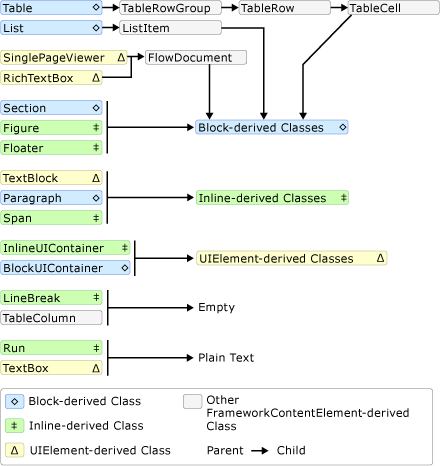
As can be seen from the diagram above, the children allowed for an element are not necessarily determined by whether it is a element or an element. For example, a (an element) can only have child elements while a (also an element) can only have child elements. Therefore, a diagram is useful for quickly determining what element can be contained in another. As an example, let's use the diagram to determine how to construct the flow content of a .
**1.** A must contain a which in turn must contain a -derived object. Below is the corresponding segment from the diagram above.
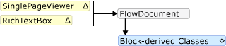
Thus far, this is what the markup might look like.
[!code-xaml[FlowOvwSnippets_snip#SchemaWalkThrough1](~/samples/snippets/csharp/VS_Snippets_Wpf/FlowOvwSnippets_snip/CS/MiscSnippets.xaml#schemawalkthrough1)]
**2.** According to the diagram, there are several elements to choose from including , , , , and (see Block-derived classes above). Let's say we want a . According to the diagram above, a contains a containing elements, which contain elements which contain a -derived object. Below is the corresponding segment for taken from the diagram above.

Below is the corresponding markup.
[!code-xaml[FlowOvwSnippets_snip#SchemaWalkThrough2](~/samples/snippets/csharp/VS_Snippets_Wpf/FlowOvwSnippets_snip/CS/MiscSnippets.xaml#schemawalkthrough2)]
**3.** Again, one or more elements are required underneath a . To make it simple, let's place some text inside the cell. We can do this using a with a element. Below is the corresponding segments from the diagram showing that a can take an element and that a (an element) can only take plain text.

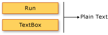
Below is the entire example in markup.
[!code-xaml[FlowOvwSnippets_snip#SchemaExampleWholePage](~/samples/snippets/csharp/VS_Snippets_Wpf/FlowOvwSnippets_snip/CS/SchemaExample.xaml#schemaexamplewholepage)]
## Customizing Text
Usually text is the most prevalent type of content in a flow document. Although the objects introduced above can be used to control most aspects of how text is rendered, there are some other methods for customizing text that is covered in this section.
### Text Decorations
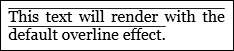
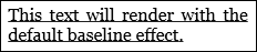
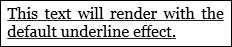
Text decorations allow you to apply the underline, overline, baseline, and strikethrough effects to text (see pictures below). These decorations are added using the property that is exposed by a number of objects including , , , and .
The following example shows how to set the property of a .
[!code-xaml[InlineSnippets#_Paragraph_TextDecXAML](~/samples/snippets/csharp/VS_Snippets_Wpf/InlineSnippets/CSharp/Window1.xaml#_paragraph_textdecxaml)]
[!code-csharp[InlineSnippets#_Paragraph_TextDec](~/samples/snippets/csharp/VS_Snippets_Wpf/InlineSnippets/CSharp/Window1.xaml.cs#_paragraph_textdec)]
[!code-vb[InlineSnippets#_Paragraph_TextDec](~/samples/snippets/visualbasic/VS_Snippets_Wpf/InlineSnippets/visualbasic/window1.xaml.vb#_paragraph_textdec)]
The following figure shows how this example renders.
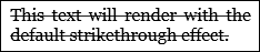
The following figures show how the **Overline**, **Baseline**, and **Underline** decorations render, respectively.
### Typography
The property is exposed by most flow-related content including , , , and . This property is used to control typographical characteristics/variations of text (i.e. small or large caps, making superscripts and subscripts, etc).
The following example shows how to set the attribute, using as the example element.
[!code-xaml[TextElementSnippets#_TextElement_TypogXAML](~/samples/snippets/csharp/VS_Snippets_Wpf/TextElementSnippets/CSharp/Window1.xaml#_textelement_typogxaml)]
The following figure shows how this example renders.

In contrast, the following figure shows how a similar example with default typographic properties renders.

The following example shows how to set the property programmatically.
[!code-csharp[TextElementSnippets#_TextElement_Typog](~/samples/snippets/csharp/VS_Snippets_Wpf/TextElementSnippets/CSharp/Window1.xaml.cs#_textelement_typog)]
[!code-vb[TextElementSnippets#_TextElement_Typog](~/samples/snippets/visualbasic/VS_Snippets_Wpf/TextElementSnippets/visualbasic/window1.xaml.vb#_textelement_typog)]
See [Typography in WPF](typography-in-wpf.md) for more information on typography.
## See also
- [Text](optimizing-performance-text.md)
- [Typography in WPF](typography-in-wpf.md)
- [How-to Topics](flow-content-elements-how-to-topics.md)
- [TextElement Content Model Overview](textelement-content-model-overview.md)
- [RichTextBox Overview](../controls/richtextbox-overview.md)
- [Documents in WPF](documents-in-wpf.md)
- [Table Overview](table-overview.md)
- [Annotations Overview](annotations-overview.md)